A playful and organic branding project crafted for children and families

Packaging Design

Dolly's Icecream

Project overview

Dolly's is an icecream brand that offers the public delicious organic ice cream contained in 414-milliliter tubs that come in three different flavors: vanilla, chocolate, and strawberry.

The characters were created using Procreate and are featured prominently on the packaging, making the design appealing and playful.

Dolly's slogan

Main target audience

Dolly’s is tailored for the Canadian organic food market, appealing to:

1. Young families who want healthy, engaging treats for their children.

2. Health-conscious millennials looking for organic, responsibly-sourced dessert options.

3. Consumers who value story-driven, character-based branding.

Process & Design Tools

Goals

Design an original organic ice cream brand with personality and storytelling.

Appeal to both children and parents through friendly visuals and wholesome ingredients.

Challenges

Balancing fun, kid-friendly design with organic, credible food branding.

Differentiating each flavor through color, texture, and illustrated characters.

Characters

The brand identity is brought to life through three illustrated charactersVanessa (vanilla), Carlos (chocolate), and Emily (strawberry)—each with a unique personality and hobby that reflects their flavor.

The friendly illustrated characters make the brand stand out on the shelves, while the organic promise speaks to modern nutritional values and lifestyle choices.

Meet Vanessa | Vainilla ice cream

Vanessa is one of Dolly's ice cream family members. She is cordial, kind, intelligent, and funny.

She enjoys outdoor activities such as biking, scootering, and walking. She also loves nature and the scent of flowers. Her favorite flower is vanilla and she likes to use one to adorn her vanilla-colored hair.

During Vanessa’s outdoor adventures, she is often accompanied by two of her best friends, Carlos and Emily. Together, the ice cream trio enjoys the Neapolitan lifestyle of Dolly’s. The joy the three of them share is just a scoop away!

Top and front view of the vainilla ice cream packaging. The label has a pattern that resembles the vainilla flower.

Musical notes

Meet Carlos | Chocolate ice cream

Carlos is another member of Dolly's ice cream family. He has a passion for music and singing, is charismatic and insightful, and can always lighten up the mood and cheer you up.

Carlos loves to play the guitar, the drums, and the bass. He also enjoys karaoke nights with his friends and family. His biggest dream is to be a rock superstar. In addition, his favorite flavor of ice cream is chocolate and he always has a Dolly’s tub ready in the freezer.

As his best friends Vanessa and Emily sometimes joke, the Neapolitan lifestyle won’t be the same without Carlos’ passion for music and entertaining others. His positivity is ever so remarkable and perhaps his love for chocolate is what helps to keep his spirits up.

Meet Emily | Strawberry ice cream

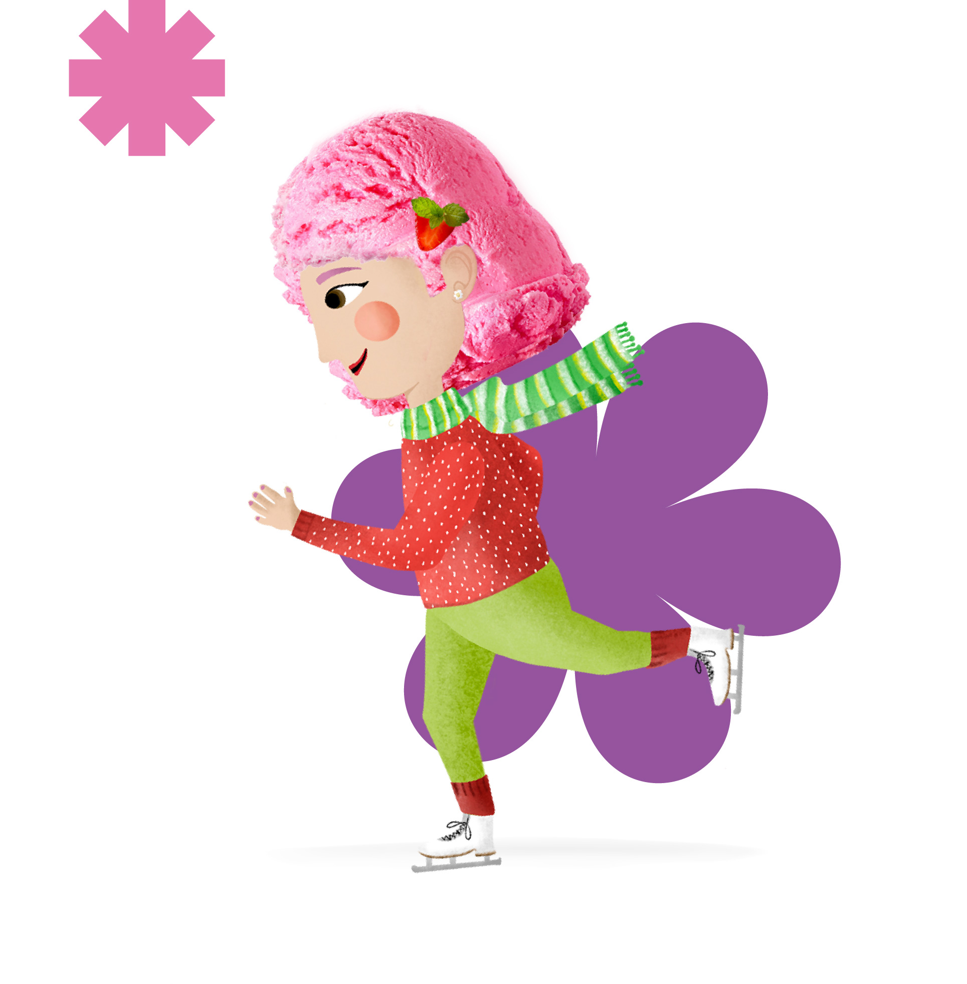
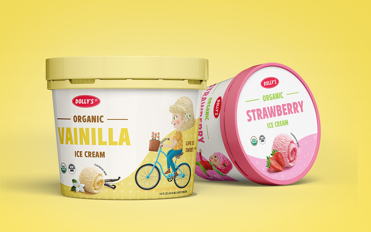
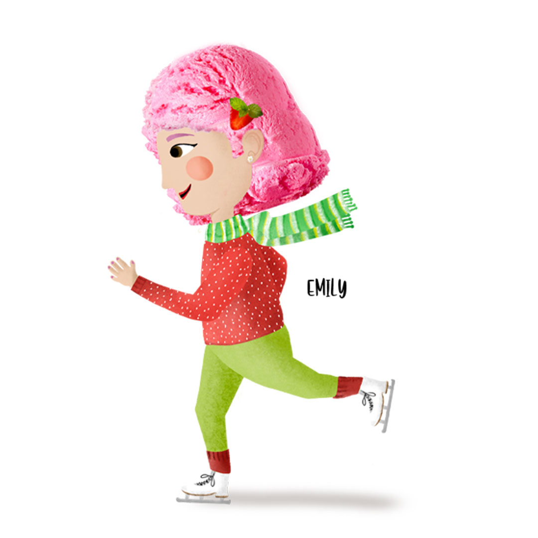
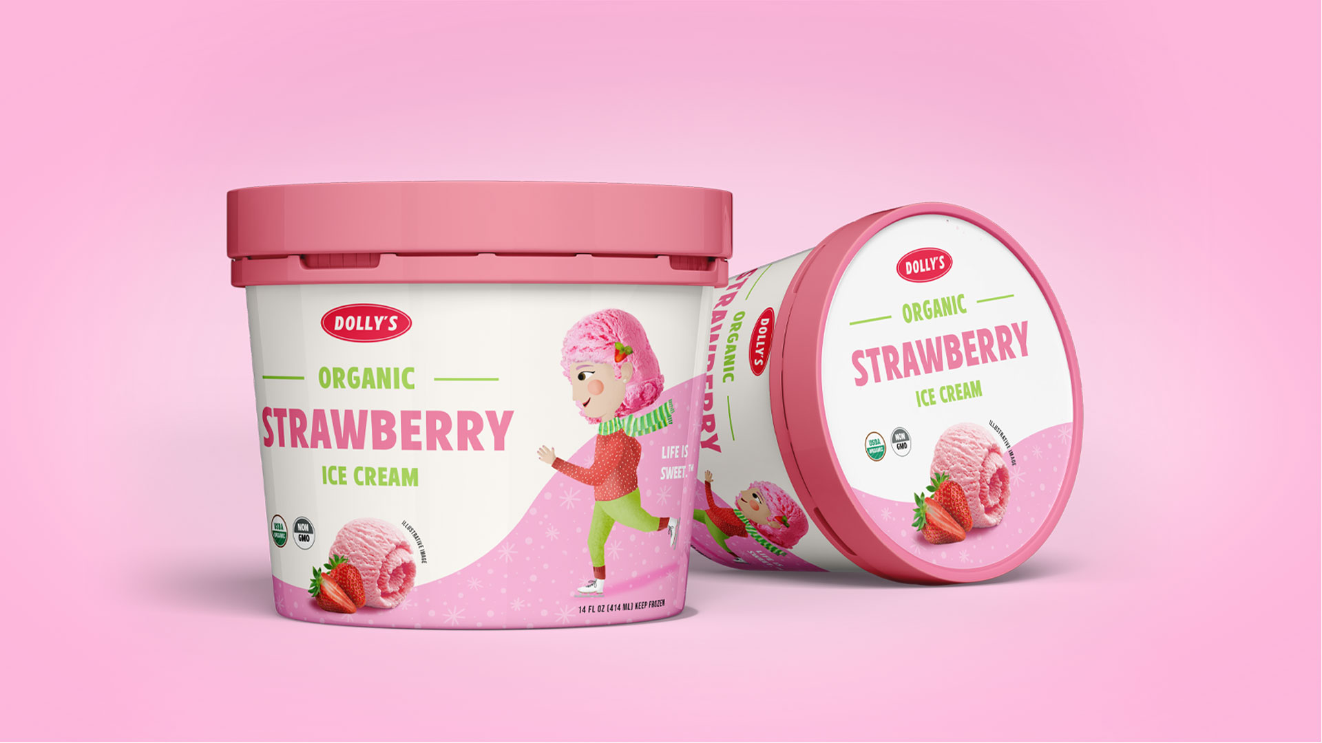
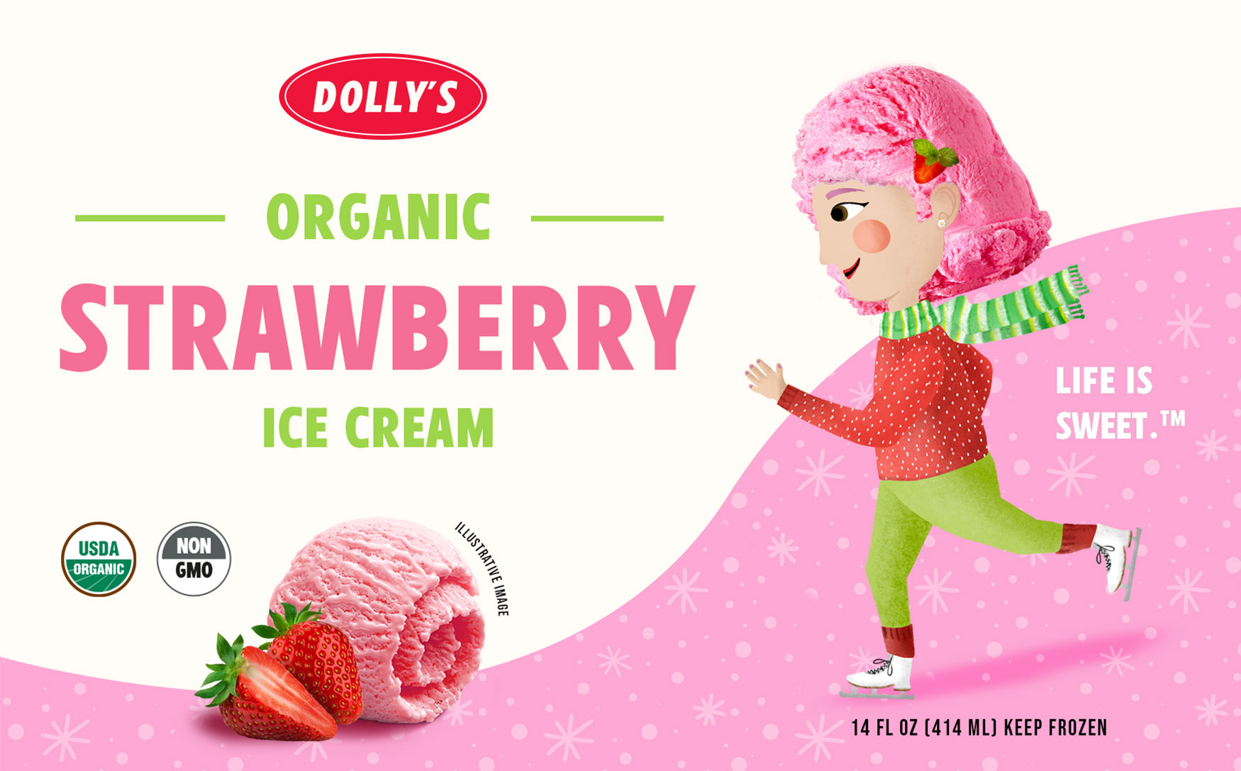
Emily is the youngest member of Dolly’s ice cream family. She is very bright, courageous, empathetic, enthusiastic, and energetic.

In addition to being a great friend, Emily enjoys ice skating, dancing, snowboarding, and even bungee jumping. She also has a very colorful style of clothing. She usually wears a pink sweater, which represents her favorite ice cream flavor – strawberry.

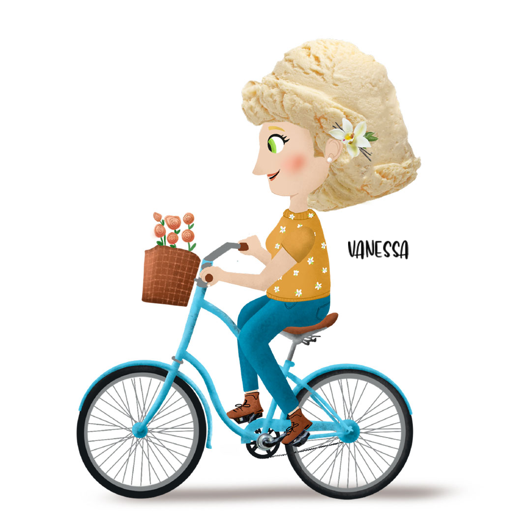
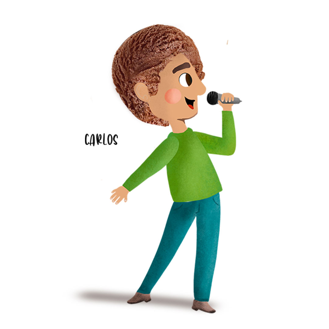
Emily’s friends, Vanessa and Carlos, are sometimes too scared to join Emily on her brave adventures. However, Emily encourages them by sharing that whenever things seem scary, it’s time for a strawberry!

Label design and texture

The packaging design for Dolly’s Ice Cream reflects the brand’s playful, wholesome personality. Each label features a character that embodies the flavor's essence through their clothing, hobby, and surrounding patterns — from riding a bicycle for vanilla to singing into a spoon for chocolate. The typography is bold and cheerful, enhancing readability and shelf appeal, while the organic certifications (USDA Organic, Non-GMO) build trust with parents.

The soft, pastel color palette and textured backgrounds were chosen to evoke the creamy, artisanal quality of the product, ensuring that each tub looks as delightful as the flavor inside. The result is a visually consistent line of products that tells a story, sparks joy, and stands out in the frozen aisle.